Excerpted from – Choosing Paint Colors | Dunn-Edwards Paints (dunnedwards.com)
As humans, we instinctively react to color. Countless objects in the natural world send messages to our brain via color. Whether it’s a blue sky, red fire engine, or a yellow and black bumblebee, color evokes a psychological response.
The Basics of Color
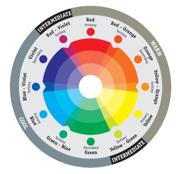
Most color wheels are based on three primary colors, three secondary colors, and six intermediates that are formed by mixing a primary with a secondary and are referred to as tertiary colors.
Primary Colors
Red (magenta), blue (cyan), and yellow are the three primary colors that cannot be made by mixing any other colors. These three colors can be mixed to create all other colors and can be combined with white or black to create tints (lighter tones) and shades (darker tones) of these colors.
Secondary and Tertiary Colors
Secondary colors are created by mixing two primary colors together. For example, mixing blue and red make purple, red and yellow make orange, and yellow and blue make green. The exact color of the secondary color you get depends on which red, blue or yellow you use and the proportions in which you mix them. If you mix three primary colors together, you get a tertiary color, which can also be made by mixing primary and secondary colors. Varying the proportions of these colors creates different tertiary colors.
Monochromatic
Clean and elegant, a monochromatic scheme feels sophisticated and stately. The scheme revolves around colors from the same family with varying intensity and value. Lighter tints and darker shades, as well as muted forms, are used. Monochromatic colors are easy to manage and always look balanced and visually appealing. However, they lack color contrast and are not as vibrant as other schemes.
Complementary
Opposition creates interest, which is the idea with a complementary color scheme. Using colors that are opposite each other on the color wheel creates visual excitement. When these warm and cool colors mix, they energize each other, bringing any décor to life. Complementary colors offer stronger contrast than any other color scheme and draw a lot of attention. They can, however, be harder to balance than other schemes, especially when working with desaturated or warm colors.
Warm and Cool Colors
When painting the interior or exterior of your home, a good first step is to gain an understanding of a color’s visual temperature. The temperature of a color – whether “warm” or “cool” – must be considered both individually and when used with other colors. Reds, oranges and yellows are considered warm colors, while blues, greens and violets are perceived as cool colors. The visual temperature of a color can accentuate or change the look and feel of your project. For example, cool colors make a small area feel spacious and calm. On the flip side, large areas feel cozier and more intimate in warm colors.
How Light Affects Color
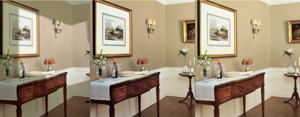
Nothing changes our perception of color more than light. Paint, textures, fixtures and furnishings are all affected by light. That’s why it’s imperative that you assess colors under the predominant lighting conditions for your projects. There are three primary lighting sources: direct sunlight, indirect sunlight and artificial lighting.
Direct Sunlight is considered the most ideal light source because it provides the truest interpretation of color and provides the best balance between warm (yellow shades) and cool (blue shades) extremes.
Indirect Sunlight is inconsistent, varying throughout the day and greatly impacting the color in a room. The intense gold rays of sunrise and long dark shadows of twilight “warm” and “cool” room colors in dramatic fashion. Indirect sunlight is the most volatile and unpredictable lighting to assess.
Artificial Lighting can be separated into either warm or cool light. Incandescent and halogen lights enhance reds and yellows, warming up a room. Fluorescent and energy-saving bulbs enhance blues and greens, cooling or flattening a room’s color. Artificial light will change colors simply by the type of bulb that is used.
Big Decisions Made Small
You can test almost any Perfect Palette® color before making a major purchase with a Dunn-Edwards® 8-oz. Perfect Palette® Sampler. Just select the color that piques your interest, and we’ll mix it on the spot so you can see exactly how it will look before you paint. It’s the quick and easy way to cut those big decisions down to size.
Put Color to the Test
To see how natural and artificial light affect your color, paint the same color on different walls. Paint the wall that gets the most light and the wall that gets the least amount of light. It’s best to paint at least a 2-foot-by-2-foot sample area on a white background. To get the best results, apply at least two coats and let the paint dry for a couple of hours. Now live with the color for a few days. See how the colors feel in the morning and evening. Which color best expresses your vision? Once you’ve made your decision, you’re ready to start painting.
MTS Is Your Painting Collaborator
MTS Painting works closely with Dunn Edwards and the other major paint manufacturers to assist our customers in planning and executing your ideal painting project. From color choice and paint selection to jobsite preparation, paint application and final clean up, MTS has the experience and know-how to keep your house looking new. Contact us for more information or schedule a free estimate.

