Keywords: Color of the Year, Upward, blissful blue, color, design
A Hint of Silver Lining
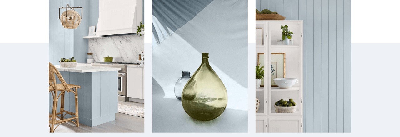
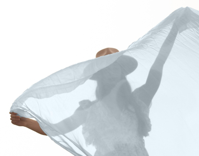
Introducing Upward, a breezy, blissful blue. The color found when we slow down, take a breath, and allow the mind to clear. Upward is like a breath of fresh air—a breezy, blissful blue that invites us to slow down, take a moment, and allow our minds to clear. It’s the color we find when we pause, look up, and appreciate the silver lining in life. Imagine a sunny sky on a carefree day—that’s Upward.
Relaxed + Carefree
“Upward SW 6239 represents the gentle forward momentum in all of our lives,” said Sue Wadden, director of color marketing at Sherwin-Williams. “It brings to life that carefree, sunny day energy that elicits a notion of contentment and peace. With this color, we invite our consumers to take a pause and infuse a new sense of ease and possibility into their spaces – one that doesn’t overwhelm, but rather establishes meditation and tranquility.”
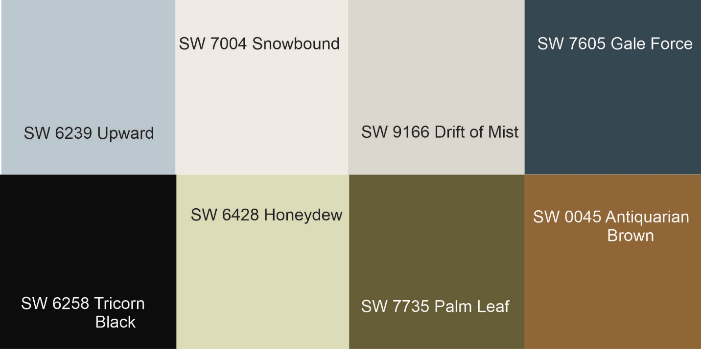
Pairing Upward with Other Shades
- SW 7004 Snowbound: A crisp white that complements Upward beautifully.
- SW 9166 Drift of Mist: A soft gray that adds depth and balance.
- SW 7605 Gale Force: A deeper blue gray for contrast.
- SW 6258 Tricorn Black: A classic black that creates drama.
- SW 6428 Honeydew: A gentle green that harmonizes with Upward.
- SW 7735 Palm Leaf: A tropical green that brings vibrancy.
Where to Use Upward
1.Living Spaces: Upward is perfect for living rooms, bedrooms, and home offices. It infuses positive energy and encourages creative thinking.
2.Bathrooms: Create a serene oasis by using Upward on bathroom walls or cabinets.
3.Accent Walls: Consider an Upward accent wall paired with neutral tones for a refreshing focal point.
4.Furniture: Paint a dresser, side table, or bookshelf in Upward to add a touch of tranquility.
Remember, Upward is more than just a color—it’s an invitation to embrace clarity, positivity, and relaxation. So go ahead, let your walls breathe with blissful blue! 💙